Tom Wolfe’s <em>The Painted Word</em>
Margot Metroland
Tom Wolfe
The Painted Word
New York: Farrar Straus and Giroux. 1975.
(Many editions since.)
Long before he died, Tom Wolfe deeded his archives to the New York Public Library. When he passed on in 2018, the NYPL put up a little “pop-up” exhibition in commemoration. It would have been bigger, but the Library had just done a slap-up interview and celebration with Wolfe a year and a half earlier, and had mounted another small display of Wolfeiana a year before that. [1]
The scraps and memorabilia in the display cases were an amusing assortment of the sort of stuff you’d expect to find in a Tom Wolfe trunk—the Man in Full, as it were. There was a letter from his custom shoemakers in London, enclosing leather swatches (“Further to your enquiry for pigskin, we are at present endeavouring to obtain the yellow colour you require or alternatively in calfskin…”); some oddball editions of his books, some sheets of elegantly handwritten mss.; and some of Wolfe’s drawings.
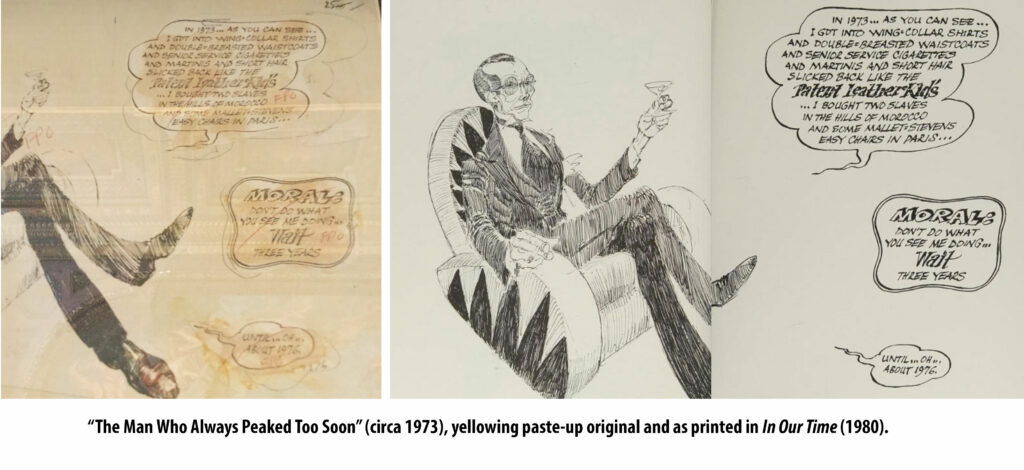 These originals were interesting from a technical viewpoint, at least. They were done for a photo-offset process, and were full of yellowing paste-ups and FPO notations (“for position only”—i.e., this is a rough version). Tom Wolfe was an old-fashioned newspaper artist, usually drawing in india ink (easily reproducible), sometimes using even ballpoints (rather less bold and reproducible) with slatherings of titanium white or opaquing fluid to give highlights. Later on, when he was doing a monthly series in Harper’s called “In Our Time” (later compiled into a book), he often got fancy and worked in graphite or crayon, giving a more “finished” and classic feel. But his best work was pen-and-ink, with a scribbly line in the manner of Ronald Searle and Edward Sorel. Instead of working up a drawing from preliminary rough sketches, he went for the immediacy of improvisation. If he started a picture and blew it, he’d just start all over again. Or paste in revisions or additions on bits of paper. You can see these pasties on the originals. But they didn’t hurt the finished product, as the newspaper’s copy camera would photograph the line-drawing’s ink but not the paste-up shadow.
During his journeyman-journalist years at the Springfield (Mass.) Union and the Washington Post, Wolfe often illustrated his own news and feature pieces, with anything from courtroom sketches to cartoons of teen-boy hairdos. Wolfe usually limited himself to line drawings on sheets or sketchpads measuring about 11×14, just the right size to fit on your lap and permit lots of detail. His satirical drawings appear in many of his books. You see them in the chapter headings for the essays in The Pump House Gang and The Painted Word. He did a whole book of caricatures from a series he ran in Harper’s in the late 1970s, mostly collected in the volume In Our Time (1980). Some of these are the fancy crayon ones, with a line like Honoré Daumier’s. If Wolfe had lived in 1830s Paris that’s what he might have been, another Daumier, remembered for graphic social satire. But as the opportunities for sophisticated visual humor were few and far between in the 1960s and 70s, he mainly put his wit into words.
All of this, I think, is necessary background to understanding Wolfe’s career, and most particularly the satirical anti-modern-art manifesto he published in 1975, The Painted Word.
It’s a little book, no more than about 100 pages (the minimum length for a book to qualify for an ISBN number; or at least it was in those days). And that’s 100 pages of big type and wide leading, with room for Wolfe’s own drawings and many other illustrations and photographs. (“A bulked-out magazine article,” the New York Times‘s John Russell sneered in his review. [2]) At first glance it looks like a breezy survey of trends and fads in Fine Art. It’s perfectly enjoyable when read that way, but in reality it’s not about art per se at all. Rather it’s a primer, or short survey course, in 20th century art criticism. It tells the story of how art itself was forced to take a back seat to something else, the something else being a written idea of what it was supposed to stand for. Hence, The Painted Word.
Wilmot Robertson at Instauration was so taken by this new book that he made The Painted Word the subject of that magazine’s first cover story in 1975. Granted, he was mainly bemused by the fact that the three main culprits in the art-criticism game—Clement Greenberg, Harold Rosenberg, and Leo Steinberg—were outsiders imposing their twisted values on Western art, and forcing the natives to accept their notions of what art should be. Abstract Expressionism, Minimalism, Pop Art; and then Conceptual Art, with all its overblown absurdist, gymnasium-size “installations.” Exactly how did this “Cultureburg” (Wolfe’s term) come to dominate and then replace what was traditionally respected as Fine Art?
Tom Wolfe gives us the answer, but does so with such a smooth and humorous touch it’s easy to mistake The Painted Word as mere satirical social commentary about the faddishness of the 20th century art world. And that answer is, briefly: the traditional notion of art, plastic and painterly art, did not exist anymore. Art was not there for your visual enjoyment. It existed as an example of some theory, some theory of literary or socio-political criticism. Critical theory. Such theory usually held that art must not be a representation of something else; it had to be only itself, pure and entire. Ergo, we got a movement to remove recognizable objects from paintings, and even to eliminate anything like depth in the paint itself. No impasto! You mustn’t lay the paint on thick—that would three-dimensional.
Wolfe did a cartoon of a painter measuring his paint-stroke depth with an “impastometer,” to make sure the pigment did not rise above the canvas (below, right).
How could this madness take hold? Well, even before Theory took hold in the 1940s and 50s, there had been an undoubted chic attached to modern art. The Museum of Modern Art opened in 1929, and for some time there was an expectation that contemporary art be daring, experimental, maybe somewhat inaccessible. But mainly Modern Art meant John Sloan, Edward Hopper, Stuart Davis, Georgia O’Keeffe, artists whose work was representational, however distorted.
In the 1930s The Container Corporation of America began its series of stark, surreal one-page magazine advertisements, each one featuring an illustration by Herbert Bayer, A. M. Cassandre, or another contemporary artist/designer. These ads stand up very well today, and apparently Tom Wolfe was much impressed by them. For The Painted Word he draws his own parody CCA ad. It’s supposed to be in the style of Picasso (crazy Guernica steed, and unhorsed Don Quixote), though it looks more like something Gahan Wilson would draw while tripping out on psilocybin (below, left).
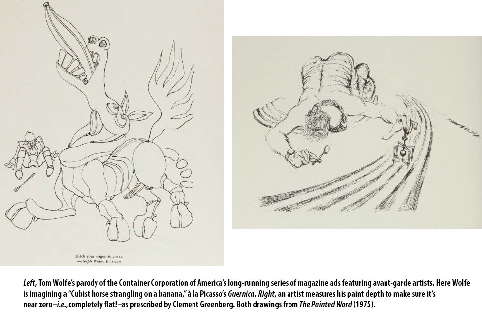 But as to all this Theory that underlay the absurd extremes of Abstract Expressionism, etc., etc.: Wolfe undoubtedly saw through that and recognized it as warmed-over 1930s Marxian ideology. So he stepped around that, because it was a minefield full of rabbit-holes. Chasing down philosophy and politics would have made for a text that was unreadable and unentertaining. And so he used a light touch. [3]
In writing about Dwight Macdonald recently, I mentioned how when he was editor of Partisan Review he encouraged Clement Greenberg to take up art criticism and tell the world that most representational art is mere Kitsch, as it is consumerist and easily accessible…as opposed to High Art which in the modern age is of necessity avant-garde…which means obscure…which means it must be understood through some kind of theory. And that was that. Greenberg wrote “Avant-Garde and Kitsch” in 1939. Thirty-five years later, Hilton Kramer at the New York Times was doing much the same thing, saying (in Wolfe’s paraphrase), “Frankly, these days, without a theory to go with it, I can’t see a painting.”
Though taking care to step around his minefield, Tom Wolfe knew exactly what he was doing when he brought out The Painted Word. He was dropping a little stinkbomb upon the art-crit world. And highbrows writing for middlebrow publications reacted accordingly. John Russell’s piece in the New York Times Book Review was tartly titled, “A reputedly clever man, an allegedly dismal book.” Russell dismissed Wolfe as a supercilious philistine, not “a very acute reader,” and someone who knew little of “the entire corpus of modern art-literature [inasmuch as] there is no sign in The Painted Word that he is familiar with it.”
The corpus in question is large, admittedly; but for Mr. Wolfe to confine his studies to critics whose names end in “berg” can fairly be called capricious… I may be prejudiced, but Mr. Wolfe’s record, as stated by himself, seems to be to argue a certain incapacity. If someone who is tone-deaf goes to Carnegie Hall every night of the year he is, of course, entitled to his opinion of what he has listened to, just as a eunuch is entitled to his opinion of sex.
Well! That puts you in your place, Master Tom! John Russell, a venerable critic and journalist (1918-2008) in London and New York, may not be much remembered these days, but that review remains a classic. Wolfe the young popinjay expected to be denounced for his imposture, and so it didn’t bother him when he was. His crime wasn’t so much in what he said as his audacity in saying it. He had no professional background in modern art criticism, you see; not a highbrow art writer or even a tenured art professor. He was just a wiseguy journalist who wore a white suit and sometimes drew wispy cartoons. He dared to mock theories and schools he did not, could not, possibly understand. Wolfe was not, as boring people like to say nowadays, peer-reviewed. He was not part of the Art Priesthood.
Another highbrow art critic who dissed Wolfe in much the same manner was Robert Hughes in Time (June 23, 1975) who really did the dozens on him in his review of The Painted Word, and then came back for more, when he and Wolfe threw spitballs at each other in a Time letter column. A mere stripling of 44, the Man in the White Suit was not someone Robert Hughes could yet take seriously:
Over the past ten years, Tom Wolfe has set himself up as the Bugs Bunny of American journalism—a squeaky, impudent dandy with a glib eye for the lumbering victim…
Wolfe’s eye for social foible was mean and exact; his sense of ideas almost nonexistent…. [The Painted Word] was meant to be a scathing indictment of modern art in general and of American painting and its social milieu in particular. Instead, it emerges as a curious document of frustration: the dandy as Archie Bunker… Wolfe tries to come across as the little boy looking at the Emperor’s new clothes. In fact, his account of the art world reads more like an eleven-year-old’s written report on a pornographic movie. The lad is spry and attentive at first. He can see things moving up and down and in and out, buttocks heaving, breasts jiggling. He has heard about sex but never had any.
And there we go again—heard about sex, but never had any!
But Tom Wolfe got his own back a few weeks later. Hughes had slammed Wolfe for writing that Franz Kline, before he went super-abstract,
“was dutifully cranking out paintings of unemployed Negroes, crippled war veterans and the ubiquitous workers with open blue workshirts and necks wider than their heads.” In fact, [Kline] never painted such pictures.
Replied Wolfe (Time, July 21, 1975):
Robert Hughes says that Tom Wolfe’s book, The Painted Word [June 23], contains so many “elementary howlers” there’s not room enough to list them; but, he assures your readers, “one example will do for all.” … Hughes says, “In fact, he never painted such pictures. Either Wolfe is making them up or he cannot distinguish between Franz Kline and Ben Shahn.”
A look at Kline’s work suggests a third possibility: namely, that the museum mail-order art survey course your man Hughes took included only one line about Kline (probably “Franz Kline —20th-cent. Am. abstract expressionist”). It’s no doubt news to Hughes, but Kline went through a period of realism, including social realism. This is a painting by Franz Kline (not Ben Shahn) called Ex-Servicemen and the Unemployed (1941). As your man says, “One example will do for all.” I’m afraid that leaves us with just one elementary howler: the one named Robert Hughes.
Tom Wolfe
New York City
Hughes, that bruising old cobber, was not going to give up just yet. Somewhat irrelevantly he now responded that the Kline painting Wolfe provided was just one painting, and anyway it was really sort of expressionist and so not real social realism.
Such arguments could get very granular very quickly, with Wolfe typically bowing out while getting the last laugh.
In later years Tom Wolfe gave interviews in which he revealed that he took his own efforts at illustration quite seriously. He had much more respect for working illustrators than for “fine artists” who often enough can’t draw at all. Was he thereby contemptuous of such successful, critically acclaimed “artists,” artists who could make stuff but it really art? And did it bias him when writing The Painted Word? How could it not?
In an interview with illustrator Chris Payne about 20 years back, he told the story of friend at a California university that had ten tenured conceptual artists in their Art department. But all these tenured faculty did was work on their big installations. The students clamored for classes in life-drawing. And so—
“They had to bring in, on a temporary basis, artists who knew anatomy, who knew perspective, who knew what colors were all about. A friend of mine was hired for that very reason. And it was made very clear that he was merely a temp.”
Notes
[1] “Deeded” is not precisely true. The archives were handed over well before Wolfe’s death. The NYPL’s trustees had eagerly sought the Wolfe trove and approved a $2.15 million price, mostly provided by a private donor, in 2013: perhaps the most expensive single-author acquisition the Library has ever made. The Wolfe archives are also open to the public—within the normal security restraints, of course! [2] Most of the text had in fact first appeared as a article in the April 1975 Harper’s, shortly before The Painted Word was published by Farrar Straus and Giroux in June 1975. [3] Many decades ago there was a fellow named Theodore L. Shaw who would take out full-page ads in Saturday Review or Commentary to promote his self-published books and pamphlets slamming the art-criticism racket. The most notable of his works was something called Don’t Get Taught Art This Way! As So Many People Do. Shaw’s insights were sound enough, but his polemical technique consisted mainly of quoting vacuous-sounding passages of art commentary and going ha ha ha! (I think he’d once had a bad run-in with an art history professor at Harvard.) Another pitfall Wolfe tried to avoid.



 I also want to say that I am disabled and wheelchair-bound, and depend upon these support animals for my household chores. They know how to load and empty the dishwasher, though we don’t have that many dishes as we all mainly subsist on Hungry-Man TV dinners. They also know how to turn on the Roomba and do some light dusting.



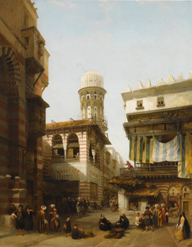 “The Bazaar of the Coppersmiths” by David Roberts (1842) sold for £403,200 on March 29, although Sotheby’s estimate going in was £60k – £80k, writes G. Fernandez at


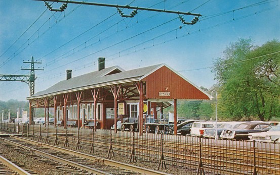 A seldom-remembered detail of the commuter-railroad experience back in the 60s is the prevalence of ‘trade advertising.’ These were posters and car-cards and billboards that you passed but barely noticed in the train car and on the platform.
 Now, those theatrical posters were straightforward. They were clearly selling something, and you knew what they were selling. Trade ads were different. Unless you were in the business, you might not know what a trade ad was up to. If it was plugging WNEW Radio, you’d probably vaguely imagine it was instructing you, the innocent commuter, to listen to WNEW Radio . . . when actually it was telling ad buyers to buy time at WNEW Radio.
 Because that would be tragic. Nothing fails worse than a clever campaign that doesn’t hit the right target. “You don’t have to be Jewish . . . to love Levy’s . . .Real Jewish Rye” is a Y&R line from the era everyone remembers now, though almost no one today eats Levy’s rye bread. I’ve had it recently, so I know it’s still being made.
 can’t even find online photographs of station platforms where these ads appeared. I guess no amateur archivist ever thought to snap them. It’s almost impossible even to find photos of Broadway posters online. That’s why I show an ad from a train schedule above, instead of the actual 1964 theatrical poster for The Subject Was Roses.
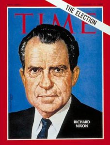
 Trade campaigns for other magazines imitated the Time model to a certain extent—e.g., the endless variants of “Forbes: Capitalist Tool,” which made a subtle pitch to the advertisers by flattering the readers. This series, which ran in and around commuter trains in the 1970s and 80s, looked vaguely like a subscription promotion aimed at ambitious young commuters.
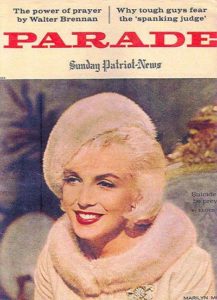 Having mass nationwide circulation was, and still is, Parade’s big selling point. But advertisers needed to be reminded of this. Parade was easy to overlook. It was and is a one-of-a-kind publication: a bland, friendly downmarket supplement, with content kept so generic it can never seem out of place in Salt Lake City, Sarasota, or St. Louis. This is a difficult trick for a Sunday supplement and Parade’s done it for, what, 70 years or something?
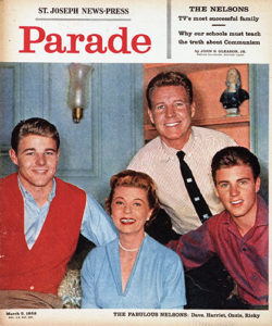 arade emphasized its mass-market, downscale orientation in a dozen ways. In the 50s and 60s, when newspapers boasted of their sturdy newsprint stock and excellent rotogravure processes, Parade went in the other direction and made itself as shoddy as it possibly could. Tabloid-sized and unstapled, its pages were all different sizes, some with rag edges, others cut sharp or with extra dog-ear flaps at the corner.
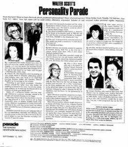 The Walter Scott column was a brilliant addition to Parade, because it ensured that there would be at least one feature that everyone would read. It’s still the first thing you see on the inside: pithy queries and answers about stars and politicians that everybody’s heard of, usually with bland but upbeat answers.
 Their perennial full-page advertisers mostly sold stuff you might never see advertised anywhere else, or at least outside a Sunday supplement. There was Zoysia grass, a magical kind of turf that evidently never needed watering or weeding. (It did turn brown in the winter, but they never told you that.)